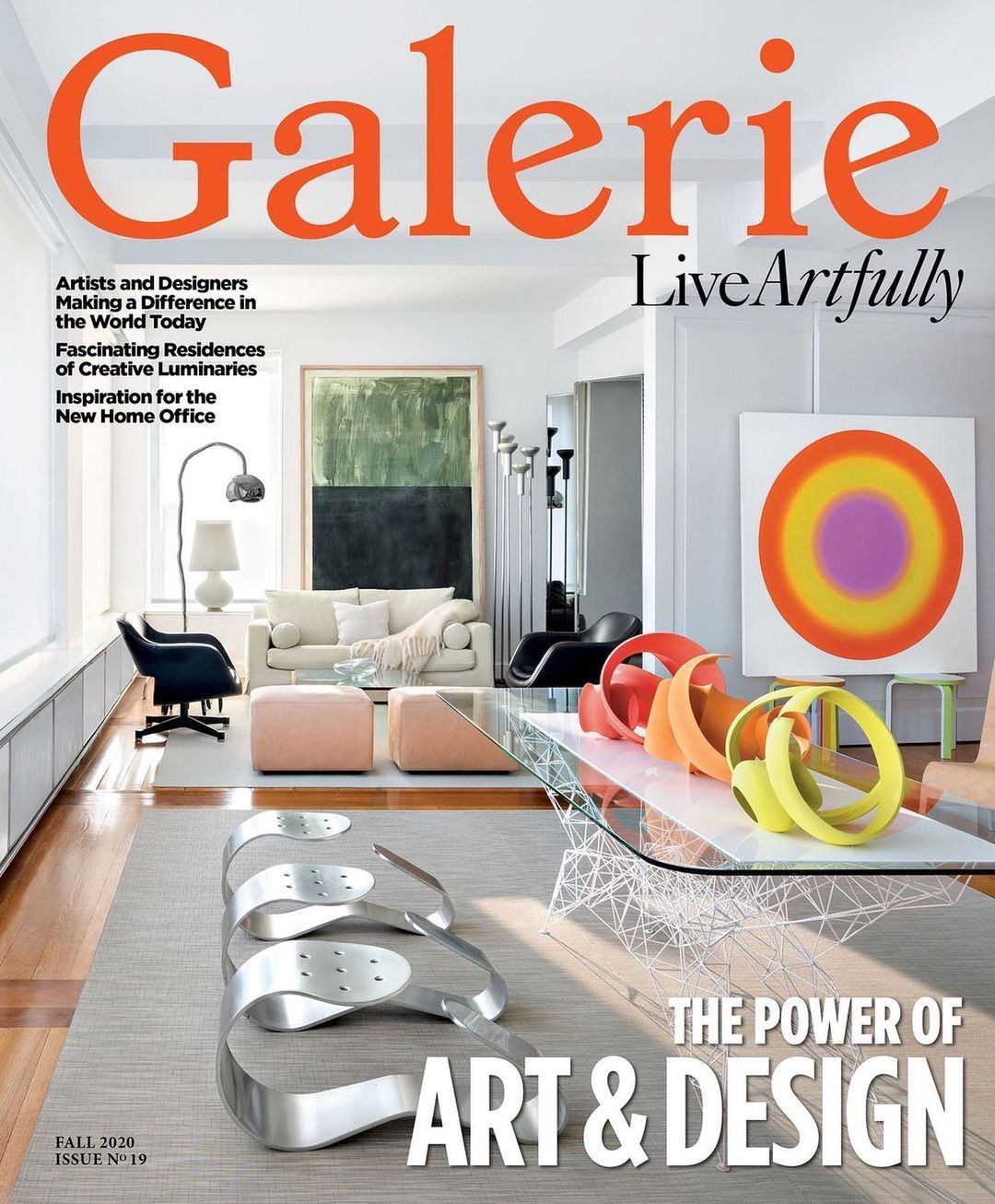
Robin Standefer and Roman Alesch's artfully curated installation at Roman and Williams Guild to display the new Farrow & Ball Colour by Nature palette.
Photo: Adrian Gaut
While colors have rotated in and out of Farrow & Ball’s 132-shade portfolio, never before in the luxury paint brand’s 75-year history has it offered a special-edition palette of new hues. But now a serendipitous confluence of events has led to the company’s new Colour by Nature palette, a selection of 16 paints pulled from Werner’s Nomenclature of Colours, a historical record of pigments found in nature used by explorers such as Charles Darwin during his voyages on the HMS Beagle and first published in 1814.

The collaboration was born out of a relationship Farrow & Ball forged with London’s Natural History Museum, which houses the original volume. “When we looked at the book and the colors, we thought there was potential for a relationship and the conversation evolved,” says Farrow & Ball CEO Anthony Davey. “The colors are very authentic, and authenticity is very important to us. That is why we thought it was such a unique opportunity, and we decided to break with tradition and do our first-ever separate palette.”
Recommended: Farrow & Ball Launches New Colors for the First Time in Years
Farrow & Ball’s staff “chromologists” whittled down Werner’s extensive list to the final 16, all of which are presented using the scientist’s original name. (Among them Broccoli Brown, Imperial Purple, and Ultra Marine Blue.) “Everything is entirely consistent with the Nomenclature of Colours, but we want to present it in a way that’s modern, contemporary, and accessible,” says Davey, who was one of the earliest adopters, using the palette’s Duck Green, Dutch Orange, and Skimmed Milk White to update a garden shed on his own property.
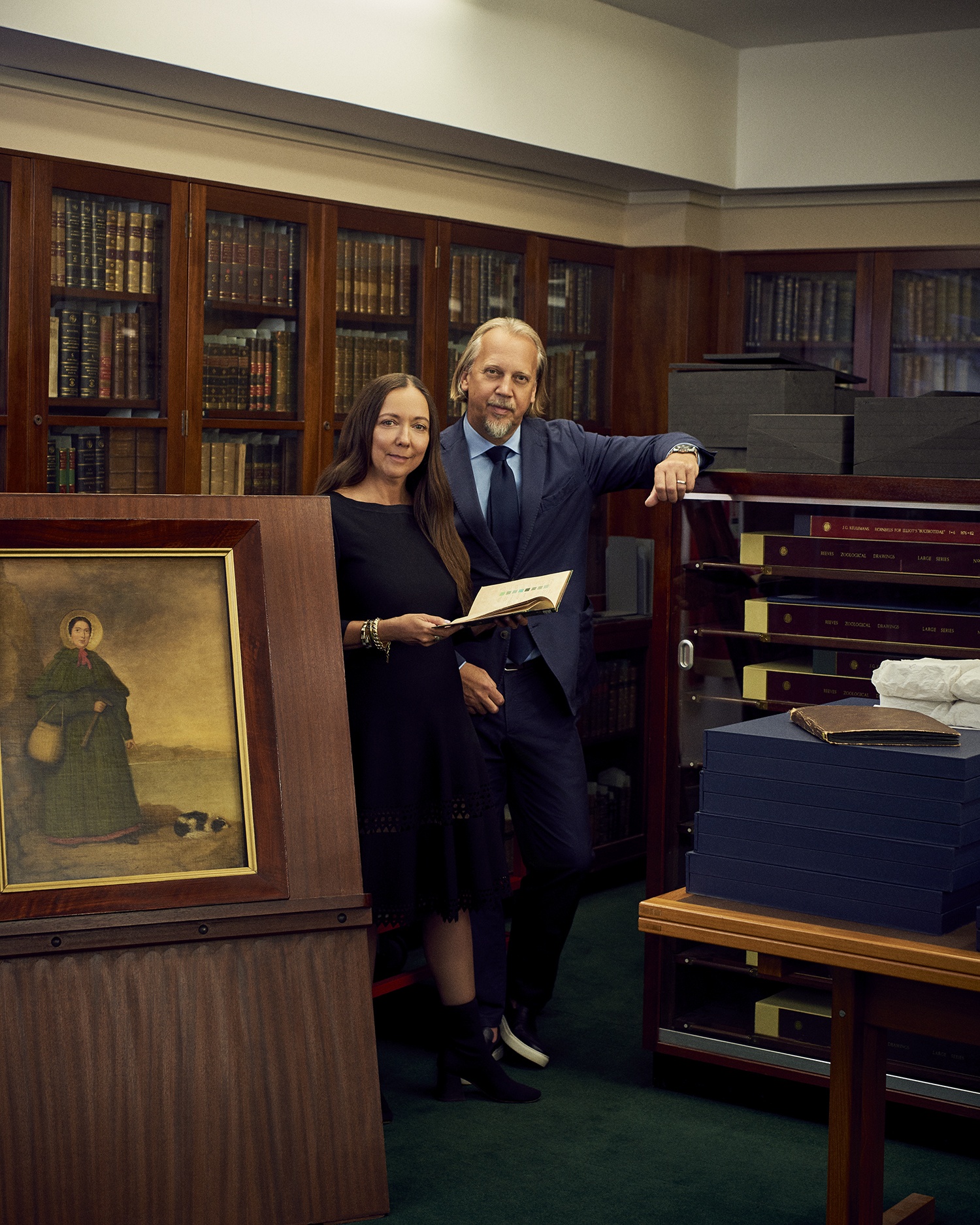
Simultaneously, Roman and Williams designers Robin Standefer and Stephen Alesch were renovating the British galleries at the Metropolitan Museum of Art and were invited to London by Farrow & Ball to view the original copy of Werner’s. The collaboration grew from there, and the New York designers were tapped to help introduce the colors to an American audience.
“What is unique about us is that we will like a color for what it is, rather than just immediately responding to it,” Alesch tells Galerie, pointing to the significance of the scientific backstory of each shade. “I want to know what it is, then look at the color, and then decide to like it or not. It’s a different process of waking your creativity as opposed to an instant emotional response.”
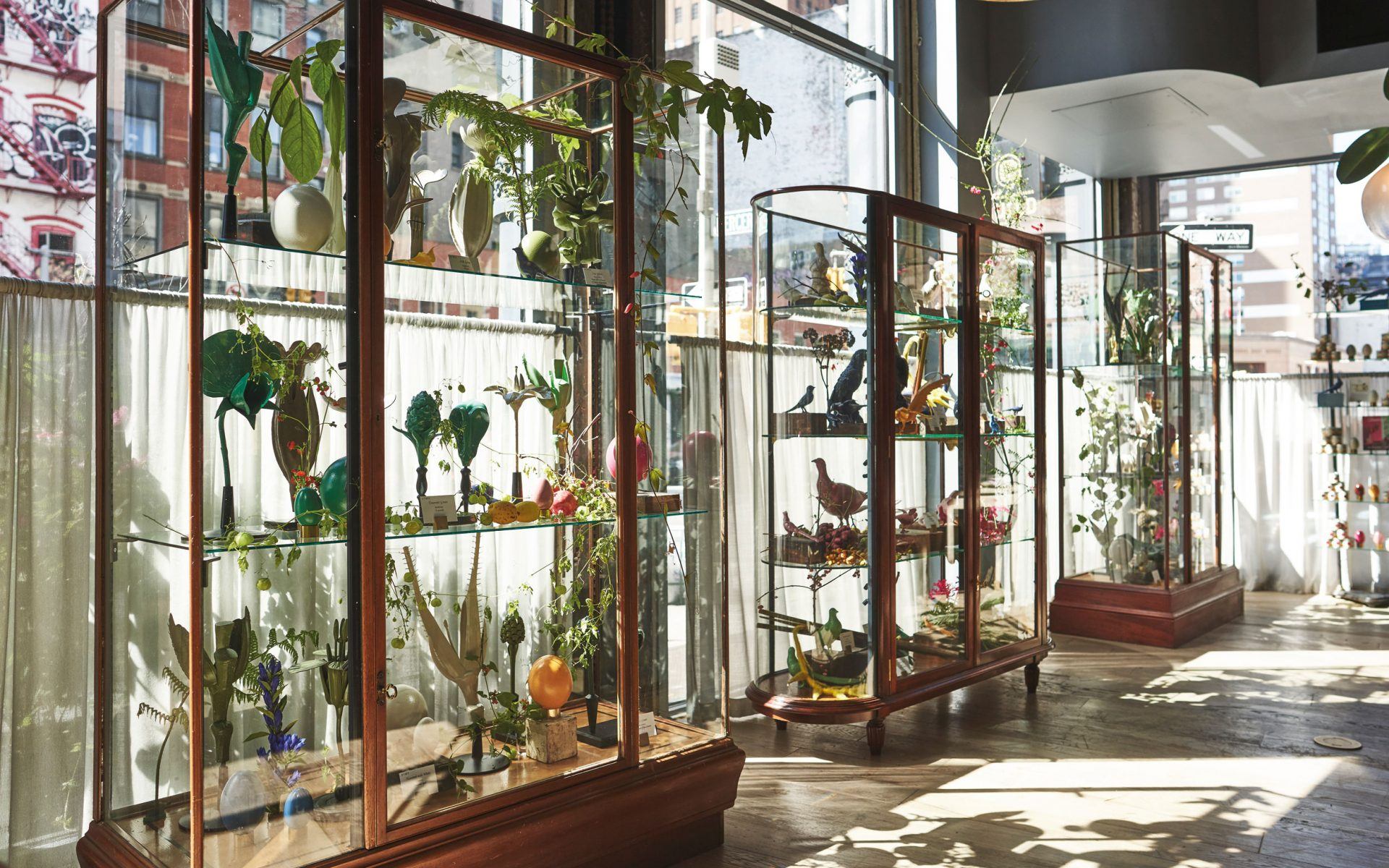
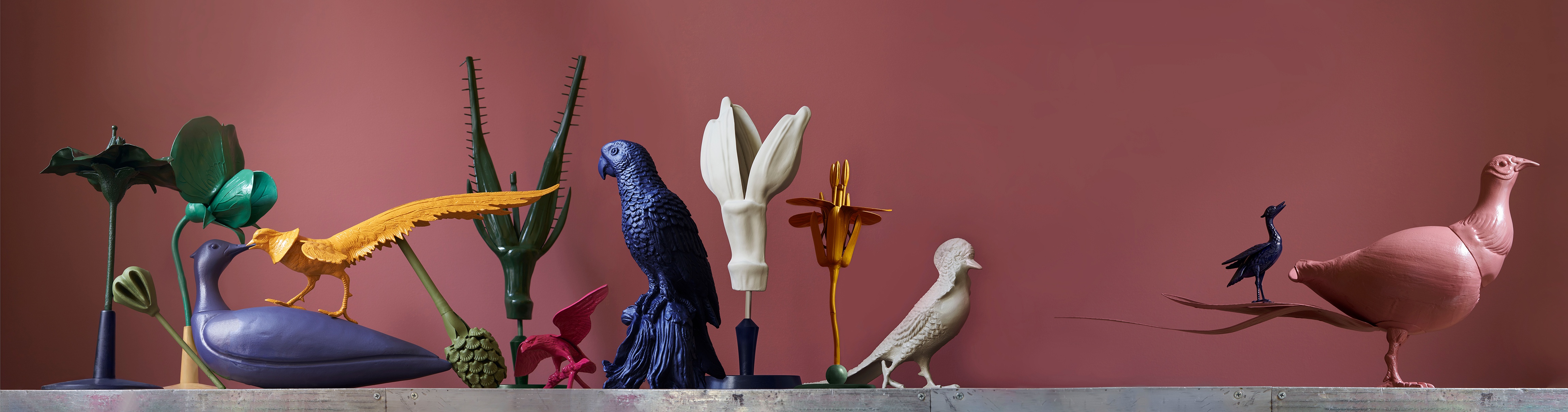
To formally debut the Colour by Nature palette, Standefer and Alesch curated a series of antique vitrines in their SoHo mixed-use space, Roman and Williams Guild, combining bronze and wooden sculptures of plants and animals, plus actual eggs bathed in the new hues. In addition, specimen cards detail where the colors were discovered in nature. (Sap Green, for instance, was found under the lower wings of the orange-tip butterfly.)
Recommended: Sir John Soane’s Museum Honors Visionary Talent at Annual Gala
“Showing the colors on objects versus flat surfaces was important to us because the inspirations for most of them come from a three-dimensional place, and we really wanted to examine that,” explains Standefer. “Sometimes, just looking at a color on a flat surface doesn’t conjure that narrative. We wanted to connect with the history of the Nomenclature, connect with nature, and also be something that was super fun to look at.”
The display is also reflective of the ethos the designers have cultivated at the Guild, which is brimming with objects that have significance versus just being beautiful. And best yet, the palette has helped possibly set the wheels in motion for their next collaboration. “It’s definitely having its influence, no question. Just dipping objects here already has us talking about it,” says Alesch. “But we’re pretty disciplined about our color palettes. If there’s a bright color, it’s very carefully discussed.”
But the palette’s mix of neutral tones and pops of saturation runs parallel with the Roman and Williams design aesthetic. “We always say, Better together,” says Standefer. “We’re better together, and the colors are better together.”